Dave Seabeck
Web Development
Graphic Design
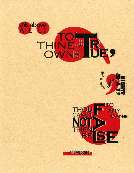
Typographic Poetry
This piece is based on a typography class assignment to represent a poetic verse using only typographic and design elements, without images. I like the visual design of the product, but it also represents an important lesson in unexpected results. The knockouts around the letters were not an intentional part of my original design. Fatefully, my printer produced this irregular output that I ultimately liked even better. Design sometimes happens best when you pull your head out of the sand and look at your surroundings. This image was created using Adobe Illustrator.


